Conversion optimization: These tricks help with the web shop
Is everything looking good in your webshop? Have you found and filled a nice template for the product pages? Then take another look after reading this text.
People make around 20,000 decisions a day, a wide variety of decisions. Picking up a toothbrush is one thing, choosing a side dish at lunch is another. Even if we would like it to be different, only a very small proportion of these decisions are actually made rationally. Five percent to be precise. Psychology now assumes that 95 percent of us are steered by our own autopilot.
This draws on experiences in the past, for example if you always take the same route to work and no longer think about whether to turn left or right. You just do it. This approach is called cognitive relief. The brain tries to save work. For the online retailer, this means, for example, that the user can build trust in the shop and then refrain from checking alternative offers, or even take out a subscription. The guiding principle for the online retailer is to bring as few disruptions as possible into the relationship and not to disappoint the user’s expectations.
Feelings buy independently
The second part of the autopilot is just as exciting from the point of view of e-commerce or online marketing, because it is based on feelings and instincts. Apple buyers often do not put the last bit of rational scrutiny into a purchase decision, because they may simply exclude the “unloved Microsoft or Android”, even if there may be better or cheaper products there. Apple is just better – even if you can rarely justify it rationally!
Not every provider is allowed to become a love brand like Apple. But the active addressing of the subconscious begins much earlier. Melissa Bateson from Newcastle University found in a practical experiment that it only takes a simple trick to convince students to contribute to the coffee cup next to the coffee maker. She glued an oversized pair of eyes to the wall unit and lo and behold: the contributions to the cash register rose by 280 percent because the coffee drinkers felt they were being watched and were thus reminded of their duty.

Big Brother is not really watching you.
Philipp Spreer from the Munich-based digital consultancy Elaboratum says: “There are a number of minimally invasive methods that are suitable for triggering intuitive behavior patterns; you don’t have to rebuild the entire website.”
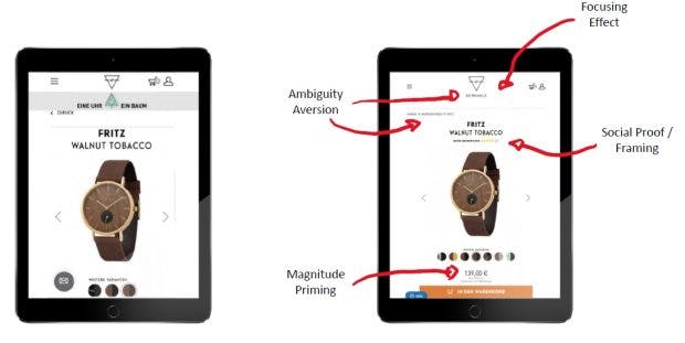
Spreer has optimized the website of the watch retailer Kerbholz and almost doubled the conversion . In detail, he changed nine page elements. He has not measured the isolated effect of each individual change and does not find it ideal either. “There was not enough time for that, so we had to validate the package of measures as a whole. With a clean measurement concept, the uplift would probably be even higher. “
The logo : Kerbholz has a very simple logo. The recognition effect was only given to a limited extent. In the new website, the company name is under the logo. The measure should work against the so-called ambiguity aversion, it should bring about more clarity and unambiguity.
The breadcrumbs navigation : The old page didn’t have any, just a back button. This measure is also intended to ensure that the user remains in control and knows where he is.
The focus : a green fir tree appeared in the header of the old page, which was intended to point out the ecological approach behind Kerbholz: a tree is planted for every watch purchased. Assuming that the user already knows this on the product side, this eye-catcher acts as a distraction with the potential to be misunderstood.
Social proof : I mentioned trust above, and that is an extremely important factor, especially for new, small companies. The new Kerbholz page shows rating asterisks directly under the product name. The trigger is called social proof or framing.
Optical priority : The old page – probably a normal shop template – showed preview images with color variations under the clock. The price was not shown on the first screen. It is immediately visible on the new page and designed in such a way that it is perceived as particularly light.

The price was not visible in the first variant of the product pages.
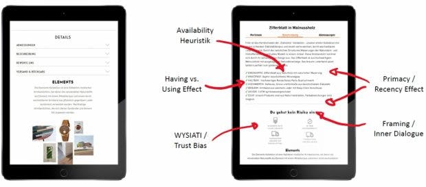
Availability heuristic : Explanations work best that are linked to something that practically everyone likes and knows from their everyday lives. In the case of notched wood, there are terms such as “natural wood” or “natural grain”. Our autopilot immediately saves such terms as positive.
Have vs. Benefit : If you can explain product functions or properties in daily use, the user immediately has the plastic feeling of closeness to the product. This is how the leather bracelet feels “soft”. The glass is “scratch-resistant” and “safe” against splashing water. It hardly matters whether the many features are actually all required by the user. “Many features” stands for “high quality”.
Doubly mocked : If there is a property that stands out in particular, it can be named twice in the description, if possible with different words. In the first bullet point, Kerbholz describes the clock made of “natural wood” and explains in the last point that you basically use natural materials. The message sits.

The repetition of the work with natural materials anchors this statement better with the customer.
And last but not least, it is important to take away the fear of a bad purchase from the user. Philipp Spreer speaks of inner dialogue and the new website anticipates: “You don’t take any risks”.
And that is clearly explained at the bottom of the product page: guarantee, right of return and free delivery at a glance. Spreer calls this WYSIATI : What you see is all there is. This element acts like a tranquilizer for the rational decision-making system and helps us to continue to make intuitive decisions.


